Hello everyone!
As one of the two grand prize winners of the SCBWI Summer Spectacular Portfolio Showcase 2020, I wanted to share some thoughts and tips that helped me put together my portfolio.
This year, I must mention, was the first time the event was organized virtually (due to the pandemic) so I didn’t have to worry about the tangible aspects of the portfolio (like getting it printed, finding a case etc.). There is some helpful information available on those aspects as well in the links I’ve shared towards the end of this post.
The points I’ve mentioned are all the things that I followed personally and which have worked for me, so I will be referencing my portfolio to back each point I make.
Most of the things that I will say here, you may probably already know since there are several great posts out there with wonderful information on how to put together a great portfolio. But even if you take away one tiny thing from this, I’ll be happy! :)
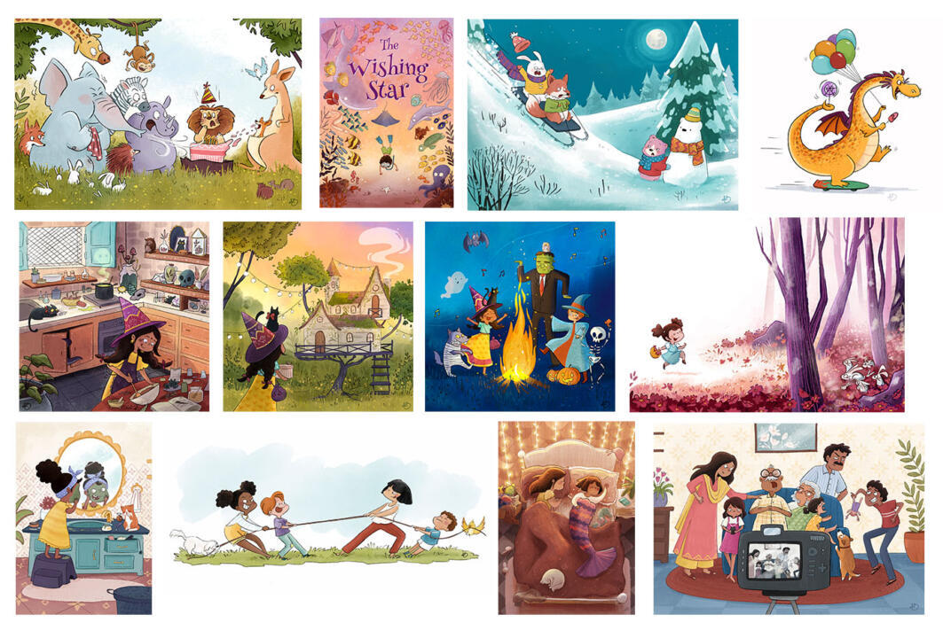
First, I’d like to share a snapshot of the pieces I submitted that won me the grand prize at the SCBWI Summer Spectacular Portfolio Showcase 2020.

PORTFOLIO TIPS (in no particular order):
1. Figure out what you love to draw and what kind of work you would like to get hired for. Exclude everything that doesn’t fit the criteria.
In my case, I love drawing characters (children and animals), cute happy things, dynamic and humourous scenes, creating a mood using light and shadow.
Since my goal is to illustrate trade picture books, I decided to exclude any B&W pieces from my portfolio since picture books are almost always all color. This gave me space to include another piece that could showcase my range of my skills much more efficiently. I do have B&W pieces on my website portfolio which displays more number of pieces.
2. If you don’t enjoy drawing something, don’t include that in your portfolio
I don’t particularly enjoy drawing vehicles/machines. It definitely good to know how to draw different things as they may be required in any sort of project, but I wouldn’t want to work on a book about anthropomorphized cars.
3. Quality over quantity
Suggested no. of pieces is usually between 10-15. I find 12 is a good number for a physical portfolio. For a website portfolio, I have between 18-21. It can be difficult to cover such a wide range of subject matter in just a few pieces but it’s good to prioritize. And very important to include only your best work!
Out of a very long overwhelming checklist of what should be in a portfolio, I selected a handful of themes which I loved: diverse children, adults, animals and fish, indoor, outdoor (forest), day, evening, night, spot, vignettes, and full bleeds. Once you focus on a select number of themes, it doesn’t seem as daunting. Then it’s just a matter of mixing them up to create a story! Any single piece can easily cover 2-4 items of your checklist.
4. Every illustration should tell a clear story
Be it a spot, vignette, full bleed or book cover, it should tell a story. This is the foundation of being a children’s book illustrator.
5. Show a narrative sequence
Following point #4, one of the most crucial aspects of a portfolio is to be able to show that you can illustrate the same character consistently in different scenarios while telling a story. Keep in mind to vary the character gestures/expressions/mood/angle in all the pieces and even the environment/format.
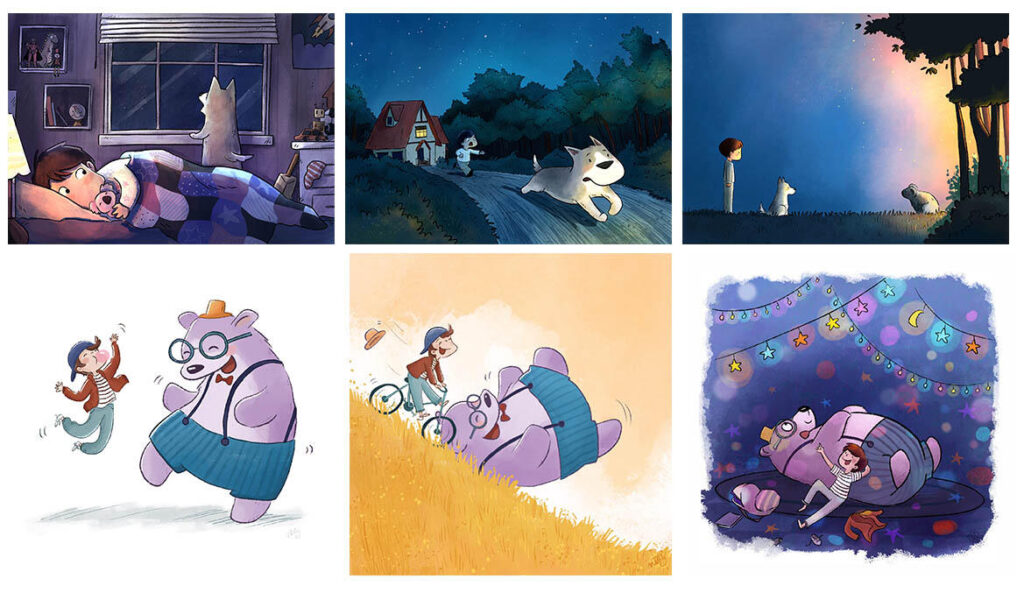
I’d like to share a few other sequences that I illustrated before. These were created with the intention of including in my portfolio but got bumped out in the end.
The first sequence, though telling a nice story, was not an efficient use of a 12 piece portfolio. It was all the same color palette and did not show a variety of mood in the characters.
In the second sequence, I tried to mix the spot, vignette, and full bleed formats. The main reason this got bumped out was that I had created the witch sequence for an Instagram challenge, and received a lot of positive feedback on my character and environment designing.

6. Include multiple examples of the same type
Since I love drawing animals and would like to work on an animal picture book, I dedicated 4 pieces for animal drawings. I also included 2 different rendering styles. One is more of a flat style and the other is heavier on light/shadow. But since I included multiple pieces for each style, it proves to the viewer that I am capable of working both ways and did not create a lucky one-off piece.
7. If you are doubtful of a piece, either work on it some more or remove it
Your portfolio is only as strong as your weakest piece. When an AD sees your portfolio which has an amazing illustration next to a “blah” looking piece, they’ll hesitate to hire you since they don’t know what kind of art they’ll get.
I was not sure of my dragon piece at first. I knew I needed a spot illustration with an animal character, so I’d reworked one of my older pieces. But after getting some feedback, I realized the reason I wasn’t feeling it because the gesture wasn’t right. After spending some more time on it, I was happy with it and it made the cut!
8. Draw a lot of children (and a few adults)
If you’re looking to get into picture books specifically, then it’s definitely advantageous to draw a lot of children from diverse backgrounds. Off late there has been a lot of buzz from publishers looking to publish more culturally diverse books.
9. Include a book cover
If you’re illustrating a book, you will definitely be illustrating the cover as well! It should show your ability to juxtaposition text and illustration in an appealing way. It needn’t be an original book, you can redraw famous stories in your own style.
10. Place your best illustrations as the first and the last page in a portfolio
A good first impression, makes the viewer look at your portfolio with heightened interest. And a good last impression will make them remember you.
I’d received a lot of positive response for my Indian family scene because of the humorous concept and distinct characters. So I decided to place that as the last image of my portfolio. One of my personal favorites was the jungle birthday scene, for the same reasons, which I placed at the beginning.
11. Flow
Take into consideration flow and consistency in your portfolio, just like you would while making a book dummy. I organized my pieces based on character. I started with 4 animal drawings, 3 pieces of narrative sequence followed by 5 illustrations of children.
12. Don’t be precious
Once I seriously started working on my portfolio, it went through 4 revisions in a span of 6 months, replacing almost all of my initial pieces. Even though I worked hard to create every piece in my first draft and often had a soft spot to highlight it in my portfolio, they were strategically replaced to add value to my portfolio as a whole, as opposed to just being an stand-alone great piece.
13. Vary your artwork
Your illustrations should vary in the setting, the composition, and have show different emotions. Variation keeps the viewer interested in what they’re seeing.
14. Get critiqued
Either get your portfolio professionally critiqued or find a critique group that can help you assess your portfolio. I can’t emphasize how helpful being part of a critique group can be (for your portfolio and growth as an illustrator in general!)
Finally, I wanted to share some helpful links which also share a lot of valuable information:
SVS Learn is a platform for online illustration classes taught by professional illustrators. They have a great course available about portfolios as well. If you’re an aspiring children’s book illustrator, THIS is the place to learn!
SCBWI’s THE BOOK also has valuable information on putting together a portfolio
https://www.scbwi.org/portfolio-tips-from-scbwi-mentorship-winners/
https://nataliemerheb.com/illustration-101/childrens-book-illustration-portfolio-checklist/
http://kidlitartists.blogspot.com/2013/07/a-few-thoughts-on-editing-your-portfolio.html
https://wheelerstudio.com/2011/08/22/portfolio-comparison-what-made-an-scbwi-winner/
https://juanamartinezneal.com/blog/2013/05/14/how-to-put-a-childrens-illustrator-portfolio-together/
https://juanamartinezneal.com/blog/2013/05/21/mentee-portfolio-vs-grand-prize-winner-portfolio/
I hope this post helps you in building a strong portfolio! Please feel free to reach out to me at NRBstudio.in@gmail.com for questions or comments!
Thank you for your time and interest in reading this post! :)
